At-a-glance home
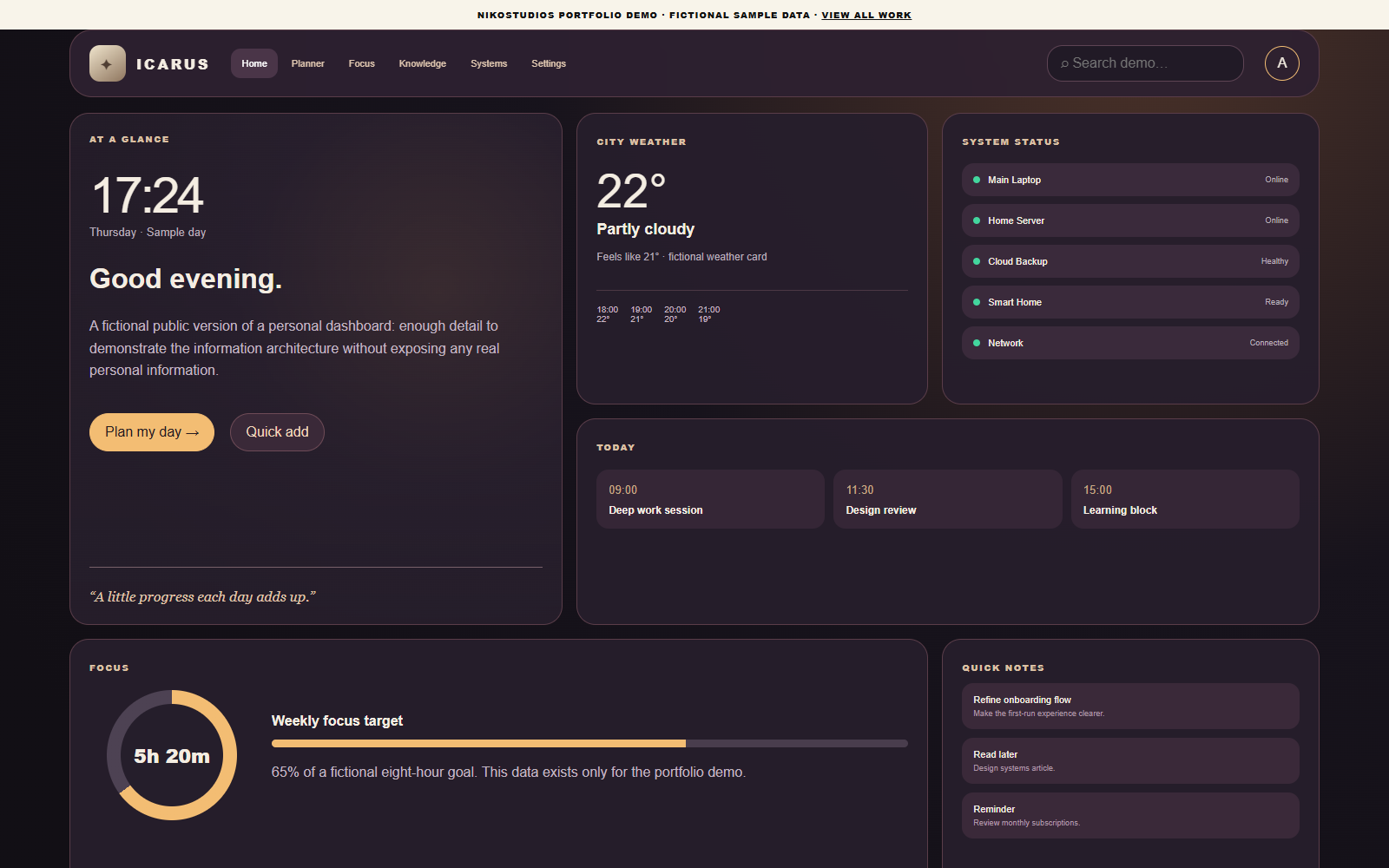
Time, day context and primary actions in one opening panel.
CASE STUDY / PERSONAL SYSTEM
A public-safe recreation of a personal command center that brings planning, focus, systems, notes and quick actions into one calm interface.
TAKE IT FOR A TEST RUN
A dashboard should help someone act, not just show more information.
THE CHALLENGE
Calendars, notes, device status, tasks and focus tools often live in separate places. A dashboard only helps if it reduces context switching instead of becoming another place to maintain.
The design goal was a single glanceable surface with deeper tools one click away.
THE SYSTEM
The public demo groups information into a few recurring questions: what matters today, what needs attention, what is healthy, and what can be acted on quickly.
The visual system keeps high-frequency actions prominent while lower-priority information stays quiet.
WHAT THE CONCEPT DEMONSTRATES
The home screen gathers daily context. Planner, Focus, Knowledge and Settings give each activity its own space, using public sample data.
Time, day context and primary actions in one opening panel.
Generic device and service health without publishing real infrastructure details.
Simple progress feedback that makes the next work block visible.
Capture lightweight thoughts without leaving the dashboard.
Common actions presented as intentional controls rather than a menu maze.
The concept collapses cleanly for smaller screens.
TRANSPARENCY
The real private project contains personal context. The public version deliberately replaces all real names, tasks, locations, devices, status information and routines with fictional examples.
Tell us what your team checks, copies or updates by hand each day.